Sometimes businesses expect big results only from big changes. A full website redesign, a new branding system, or a complete marketing overhaul. But in reality, some of the most powerful improvements come from very small adjustments that most people ignore.
There are cases where a website does not need to be rebuilt. It just needs one or two smart changes that make it easier for visitors to take action. And that is exactly what often increases inquiries more than anything else.
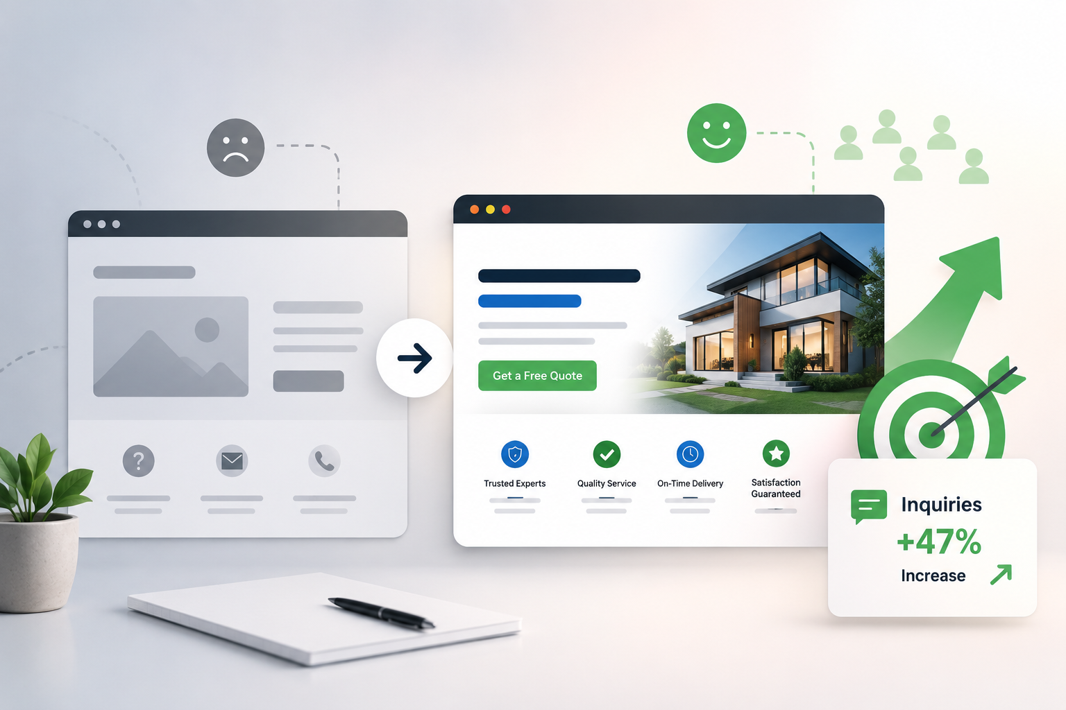
When Traffic Was Not the Real Problem
In many situations, the website is already getting visitors. People are clicking from Google, ads, or social media. But the inquiries are still low. That is usually where confusion starts. Business owners think they need more traffic, but the real issue is what happens after the visitor arrives.
People are not filling forms, not calling, and not staying long enough to understand the service. This is where small changes start to matter more than big marketing efforts.
The Change That Made the Difference
In one simple case, the biggest improvement came from changing just one thing on the website: the way the call-to-action was presented.
Earlier, the website had a contact page that users had to find manually. The “Contact Us” button was there, but it was not visible enough on key pages. Most visitors were dropping off without taking any action.
The change was simple. The call-to-action button was moved higher on the page, repeated in multiple sections, and rewritten in a more action-focused way. Instead of a plain “Submit,” it became something like “Get Free Consultation” or “Request Pricing in Minutes.”
This small adjustment made the next step clearer and easier for users. They select the choice that seems the safest.
Why Small Changes Work So Well
People online do not think deeply when they visit a website. They scroll, scan, and make snap judgments. If something feels unclear or requires effort, they leave immediately.
A small change like improving button text, adjusting placement, or reducing form fields can remove that friction. When friction reduces, action increases. It is that simple.
Many websites lose inquiries not because they are bad, but because they make users think too much before acting.
The Power of Simpler Forms
Another small but powerful change often comes in forms. Long forms with too many fields can silently kill conversions. When the number of fields was reduced to only essential information like name, phone, and requirement, inquiries increased almost instantly.
Users feel more comfortable when they do not have to share too much information upfront. The easier it feels, the more likely they are to complete it.
Better Messaging Also Plays a Role
Sometimes the change is not technical. It is about words.
Changing a headline from something generic to something clearer and benefit-focused can completely shift user behavior. Instead of saying “Welcome to Our Services,” a more direct message like “Get More Leads for Your Business in 30 Days” instantly connects with the visitor’s intent.
When users understand value quickly, they are more likely to respond.
What This Really Teaches Us
The main takeaway from all of this is straightforward. You do not always need a major redesign to get better results. You need to understand user behavior and reduce friction wherever possible.
Small improvements in clarity, structure, and messaging can create a big difference in inquiries. Sometimes a button change, sometimes a headline rewrite, sometimes just removing unnecessary steps.
A website’s appearance is only one aspect of it. It is about how easily it converts visitors into leads.
And often, the smallest change becomes the turning point that starts generating consistent inquiries.